
Designing for Cats!
How we designed a cat magazine.

In the early days of Broccoli magazine, designer JJ Wright would fly up to Portland before the start of an issue to do a bit of brain melding with founder and creative director Anja Charbonneau. They would go to the Central Library’s magazine room and dig through old publications of all kinds: cooking, home decor, cake decorating, gardening. “The most influential by far was Cat Fancy from the 1960s and ‘70s. They were so creative in terms of unusual text layouts and art treatments,” says JJ. “This was several years before the first issue of Catnip, but it’s safe to say those library discoveries worked their way into Catnip.”
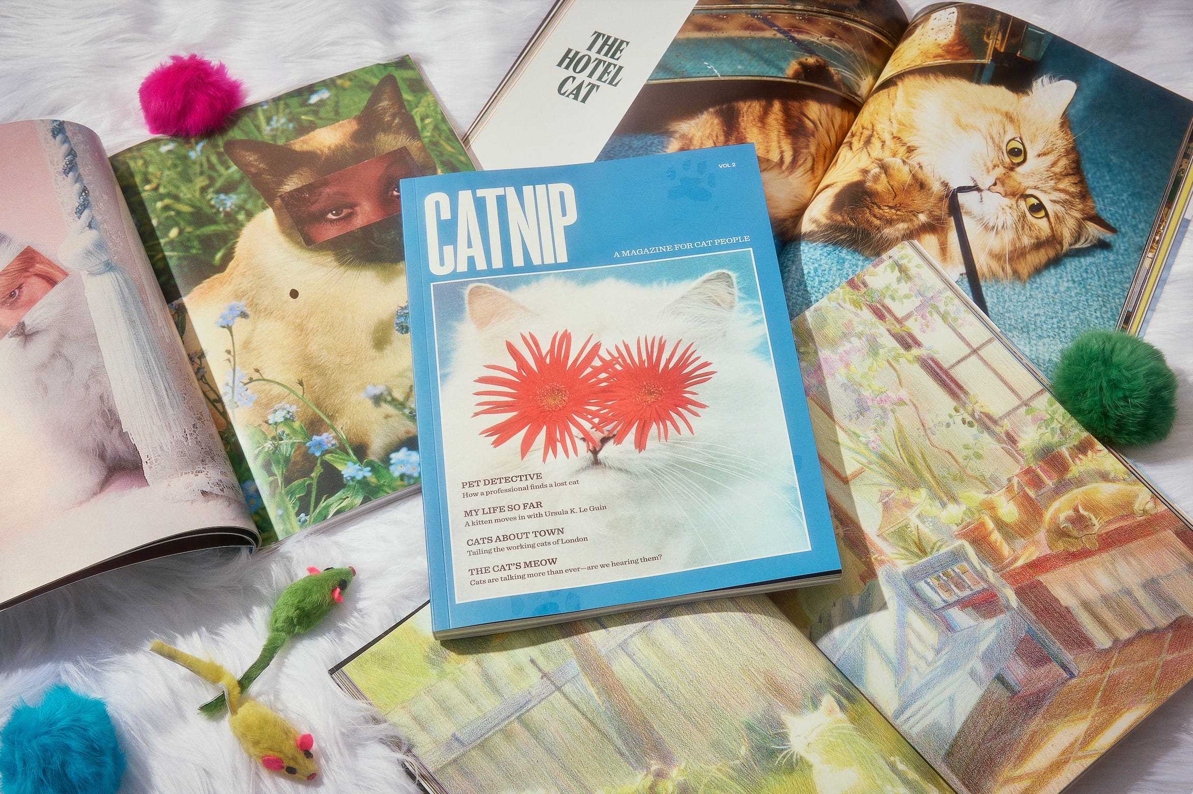
The original brief for the design of Catnip was to give the reader the feeling of “wandering through the aisles of the best thrift store ever”: an eclectic clash of cute (but slightly off) references and textures from different decades. Catnip: Vol 2 is finally here (!!) and JJ kept some of our favorite elements from the first issue—like the almost-invisible paw prints on the cover, as if a cat had tiptoed across the magazine. But there are lots of new design treats sprinkled through the second issue, too, and since we learned so much when JJ dug into the design of Broccoli’s music magazine, Heartbeat, we asked her to take us for a spin through Catnip: Vol 2.
Our conversation about turning off habits and the great coated-vs.-uncoated paper debate is below:
When you began working on Catnip: Vol 2, where did you start?
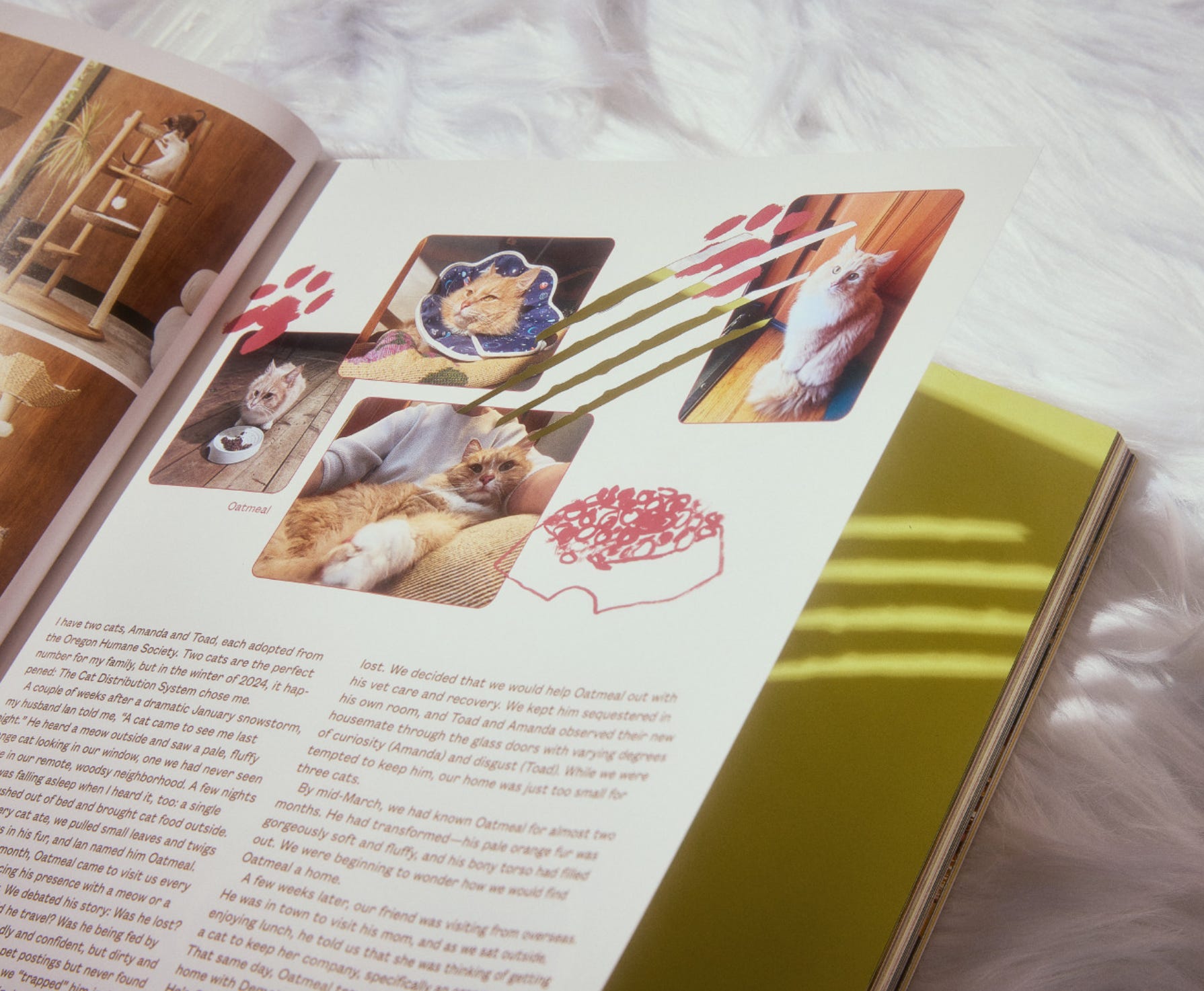
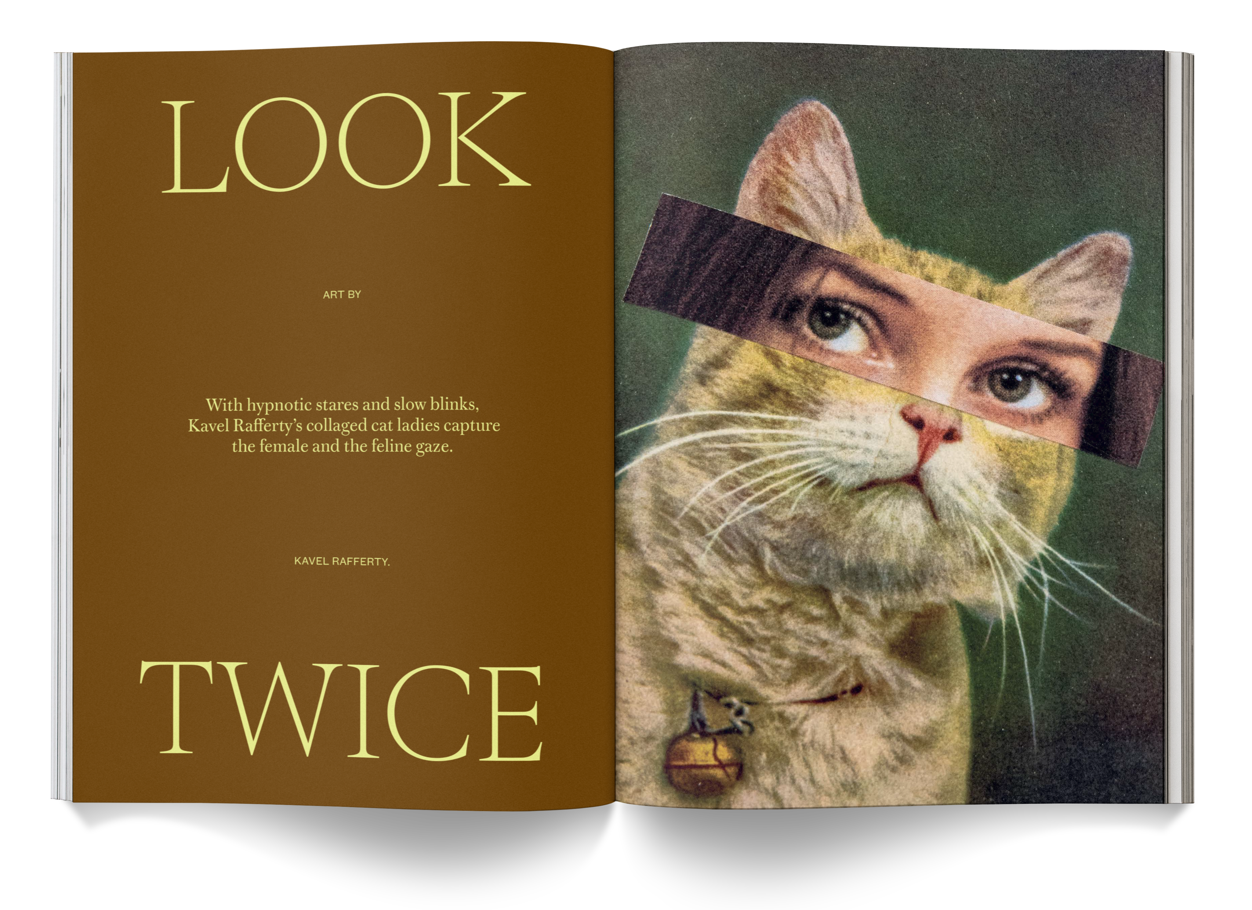
JJ: With every publication, I almost always begin with art-heavy pieces. For Catnip: Vol 2, that was Kavel Rafferty’s collages of cats with sultry human eyes, a story about one woman’s enormous Siamese cat memorabilia collection, and Anna Kliewer’s riffs on famous artworks with cats spliced in. This allows me to visually digest a big chunk of art right off the bat, which helps set the tone for the publication. Art features are lighter in terms of design needs, but building them out influences elements like colors and typefaces. Once I have a few of those building blocks in place, I can start to figure out treatments for smaller or more design-intensive stories, like “Pet Names” (a musing on the way cats’ names tend to evolve) or “Feline Mystique” (a feature on a cat-themed oracle deck).
I saved the “Tabbyloid” for last. In fact, I pushed it off so much that I was designing it the day before we went to print. I knew it’d be a challenge—a fun one!—because it’s its own tiny visual world, distinct from the rest of the publication, and it required a different headspace to design.
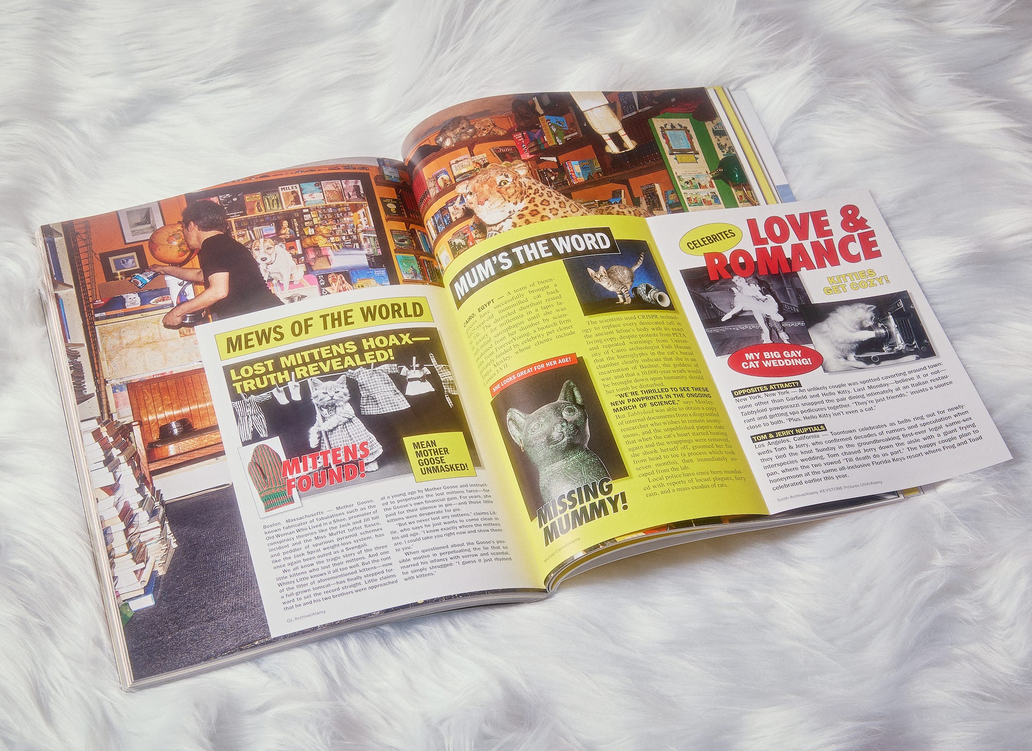
Readers of Catnip: Vol 1 will remember the “Mewsletter” insert, but we wanted to do something different for Vol 2. The “Tabbyloid” is a fold-out mini-magazine within the magazine that’s a satire of those sensational tabloids by grocery store checkouts. How did you approach making something look tacky on purpose?
JJ: I had to accept the bizarre discomfort of its design process. If you look at the National Enquirer, for example, it’s basically screaming at you: It’s all caps, tons of exclamation points, framed call-outs. Your eye bounces all over, looking for somewhere to land. I loved the intense use of red and yellow, the awkward drop shadows, and the extreme layout density. It’s wild. It’s hard to turn off your design habits, and Anja had to push me to make it more nuts.
While Catnip doesn’t have themed sections, the design helps organize the content via paper choices, switching between coated (glossy) and uncoated (matte). Tell me about those two treatments.
JJ: I’m a sucker for a paper stock change in a publication—it’s a little surprise moment for your hands. In Catnip, our uncoated paper is a warm off-white (rather than a pure, bright white), which is great for stories that benefit from a more retro, lo-fi treatment. A great example of this is “Found Cats,” a collection of lost cat flyers with happy endings. DIY Xerox flyers feel right at home on this paper. The uncoated section has a very clear, tight design. It’s primarily duotone and uses the same title and body fonts throughout. There are illustrations by Lauren Doughty in that section, and having those exist in this tight little series of pages in a loose, layered manner feels fun—as if cats and mice and paws are dropping in unexpectedly.
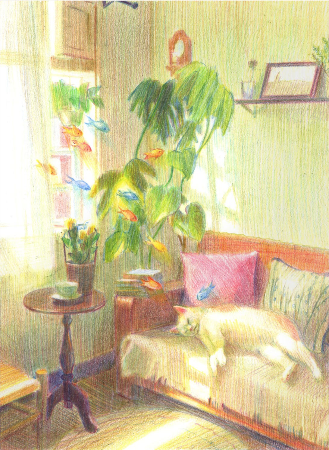
Typically, a full-color, art-heavy story lives in our coated sections because the coated paper really helps the artwork shine. That said, there are always exceptions. Nikita Chan’s pencil drawings of cat daydreams are so textured and mesmerizing that the toothiness of uncoated paper seemed like the perfect surface to print on.
Let’s talk type. What fonts did you use?
JJ: My two favorite additions to this issue are Job Clarendon and Job French Clarendon, both created by David Jonathan Ross. We’ve used many of his wonderful typefaces in various publications. These two are contemporary reinterpretations of Clarendon, a classic slab serif from the mid-1800s with an old letterpress quality to it. Job Clarendon feels very 1970s to me, and Job French Clarendon is just over-the-top western kitschy—both are perfect for Catnip. One typeface you might recognize from the last issue is ES Nein. It’s the title font and is used heavily throughout the uncoated section; it feels like a no-frills relative of Job Clarendon.
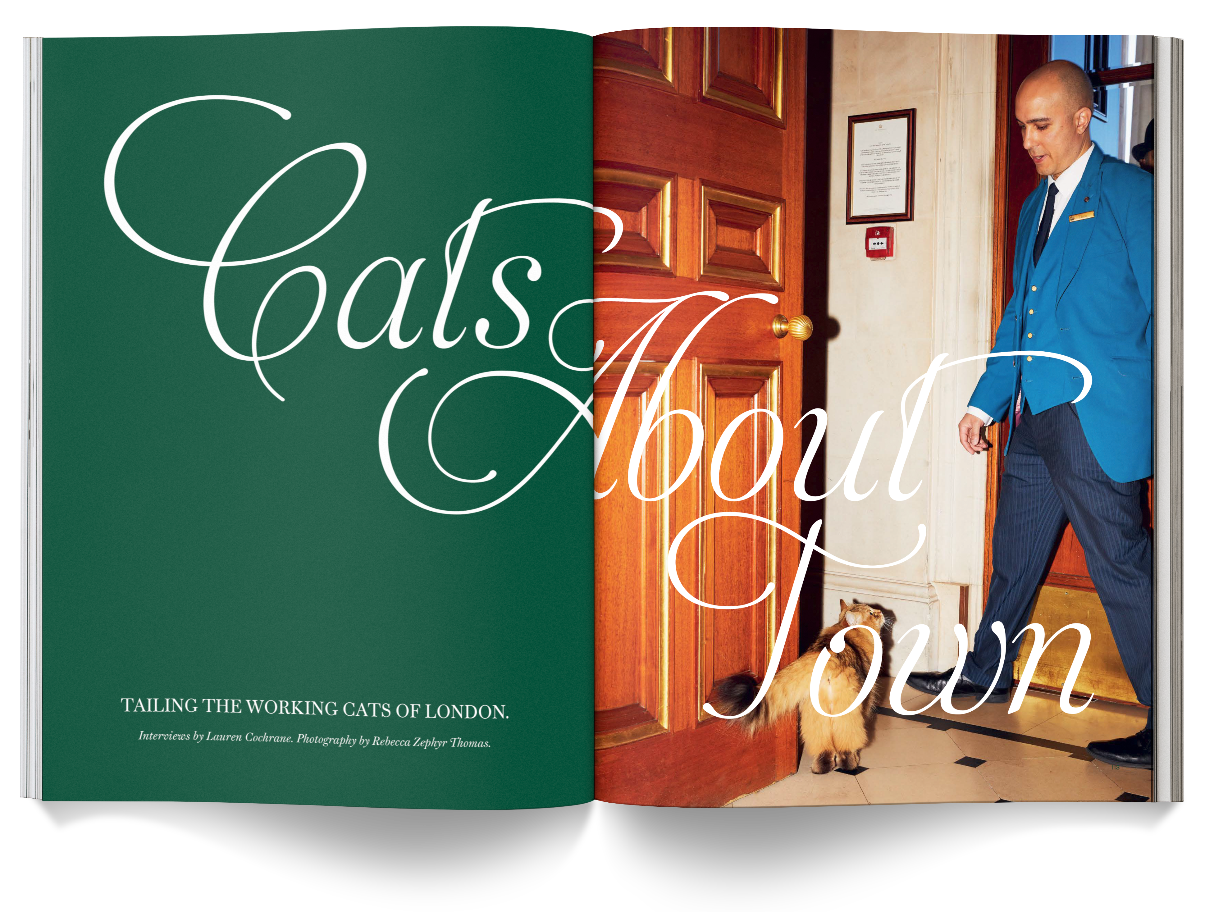
Catnip: Vol 2 breaks a Broccoli record for longest feature: “Cats About Town,” which profiles local celebrity working cats in and around London—it’s 40 pages! How do you negotiate the amount of space to give a piece?
JJ: We love a big mag over here. When a feature has that many great images, we’ll run it as long as the issue’s page count allows.
Get your paws on a copy of Catnip: Vol 2 here.
And read about how Catnip: Vol 1 shook up Broccoli’s world here.